10 Aug 2022
Developing and promoting a recognisable TechOceanS brand is a key strategic focus of Theme 5 – Dissemination and Engagement. The fundamental idea and core concept behind the visual brand identity is to create a distinctive, attractive and relatable association with the project.
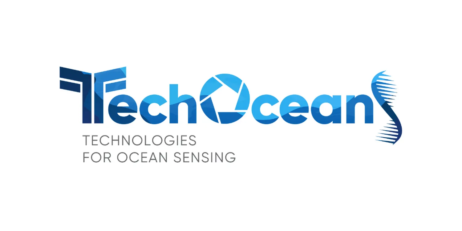
The project logo is an integral part of the brand, identifying the project in a way that is recognisable and memorable. The TechOceanS logo is constructed using a combination of rounded bold lettering, harmonious and representative colour choices and stylised uppercase letters signifying the key aspects of the project such as biological sensors, coverage of a range of ocean depths, imagery and genomics.
The TechOceanS logo derives its meaning from the qualities of the various sensors it symbolises. The “T” is designed to imitate a T-cell, the “O” a camera/sensor and the “S” is shaped to represent a strand of e-DNA. The letter colourings are inspired by the range of depths of the marine environment which the project will explore, demonstrating the commitment to covering several essential ocean variables.
At the start of the project two distinct logos were presented to the coordinating team. While neither were ultimately chosen, these early iterations sparked inspiration for a unique and creative sketch which evolved into the final logo concept adopted by the consortium.
The TechOceanS project logo is available in two different versions, full colour, and mono colour (black and white). Guidance on how to properly utilise the TechOceanS logo can be requested from WP2 leader AquaTT (keegan@aquatt.ie).
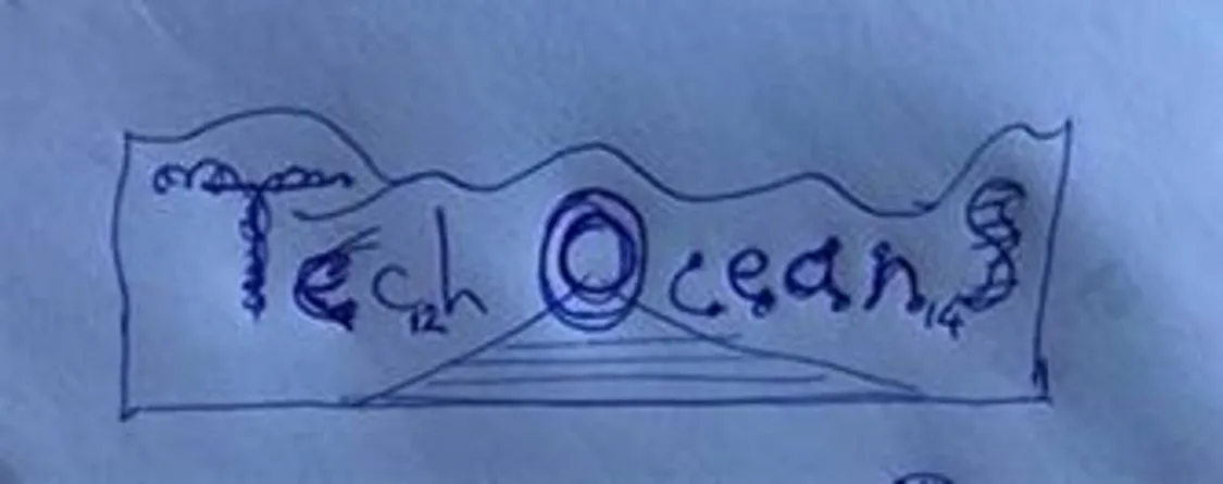
TechOceanS logo concept sketch
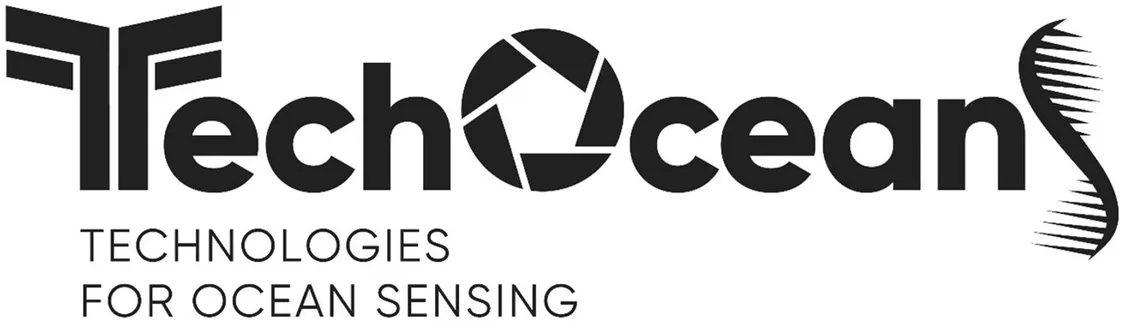
TechOceanS project logo in black/white
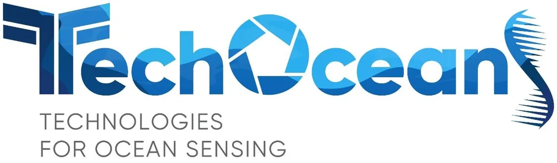
TechOceanS project logo in full colour